Knishka Brand Identity Design
Brand overview
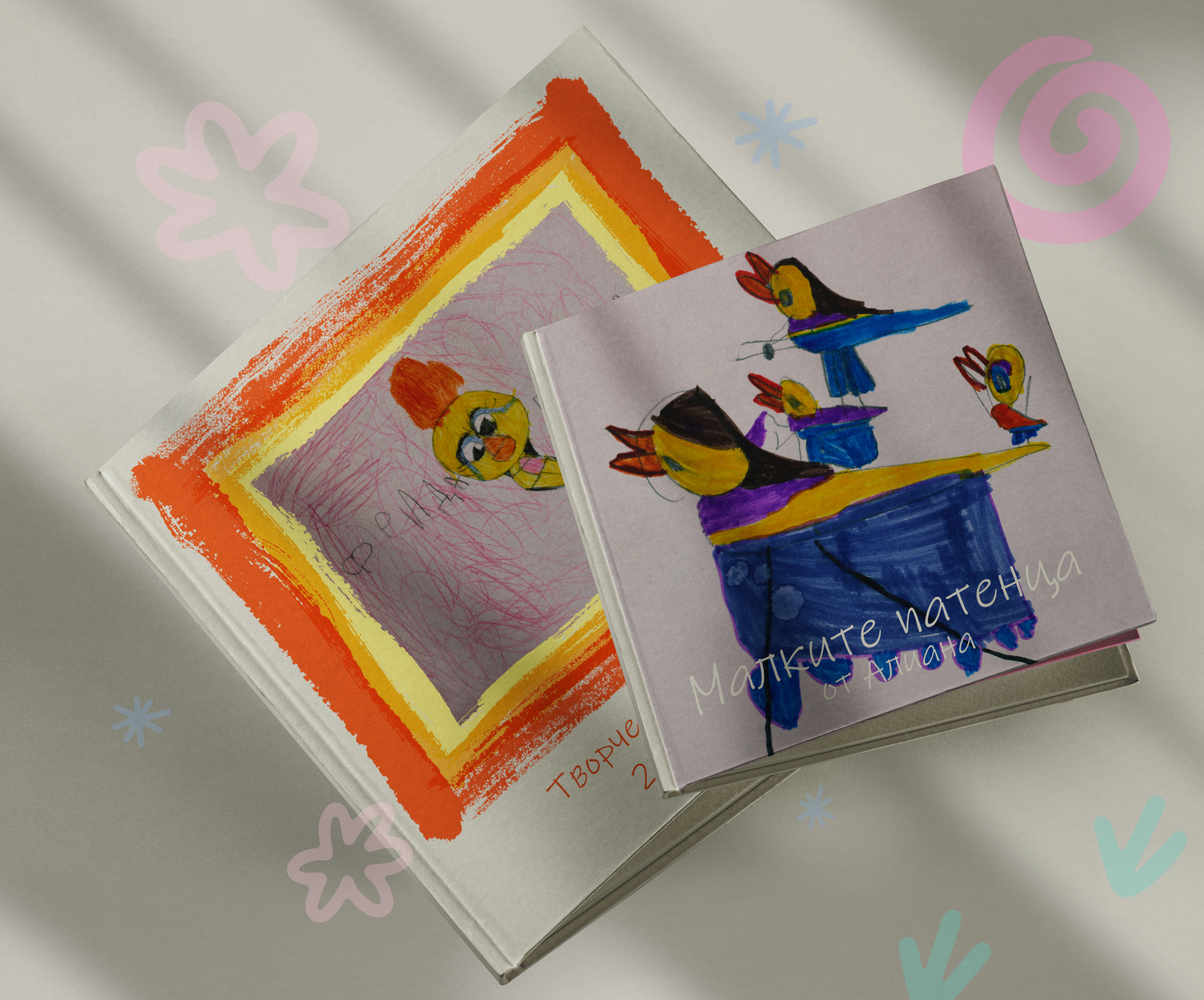
Knishka is a purpose-driven brand created to preserve children’s creativity in a meaningful, lasting way. The brand transforms children’s drawings and creative expressions into thoughtfully designed books turning everyday artwork into emotional keepsakes that grow in value over time.
At its core, Knishka exists to solve a quiet but common problem faced by many parents - how to store, organize, and preserve children’s creativity without losing its authenticity, emotion, or story.

Naming & concept
In Bulgarian, the word “книжка” (knizhka) is often used as a diminutive — a small, beloved book, something personal and close to the heart. "Knishka" plays with this meaning.
The name is a deliberate wordplay, replacing the traditional letter with "Ж" (zh) with “Ш” (sh), turning the familiar into something distinctive. More importantly, it reflects the core idea of the brand: preserving the "thread" of childhood through creativity.
This “thread” represents imagination, growth, and emotional continuity - something so fragile in the moment, but incredibly valuable with time. Because ten years later, these creations are no longer just drawings. They are memories, identity, and heritage.
Logo design approach
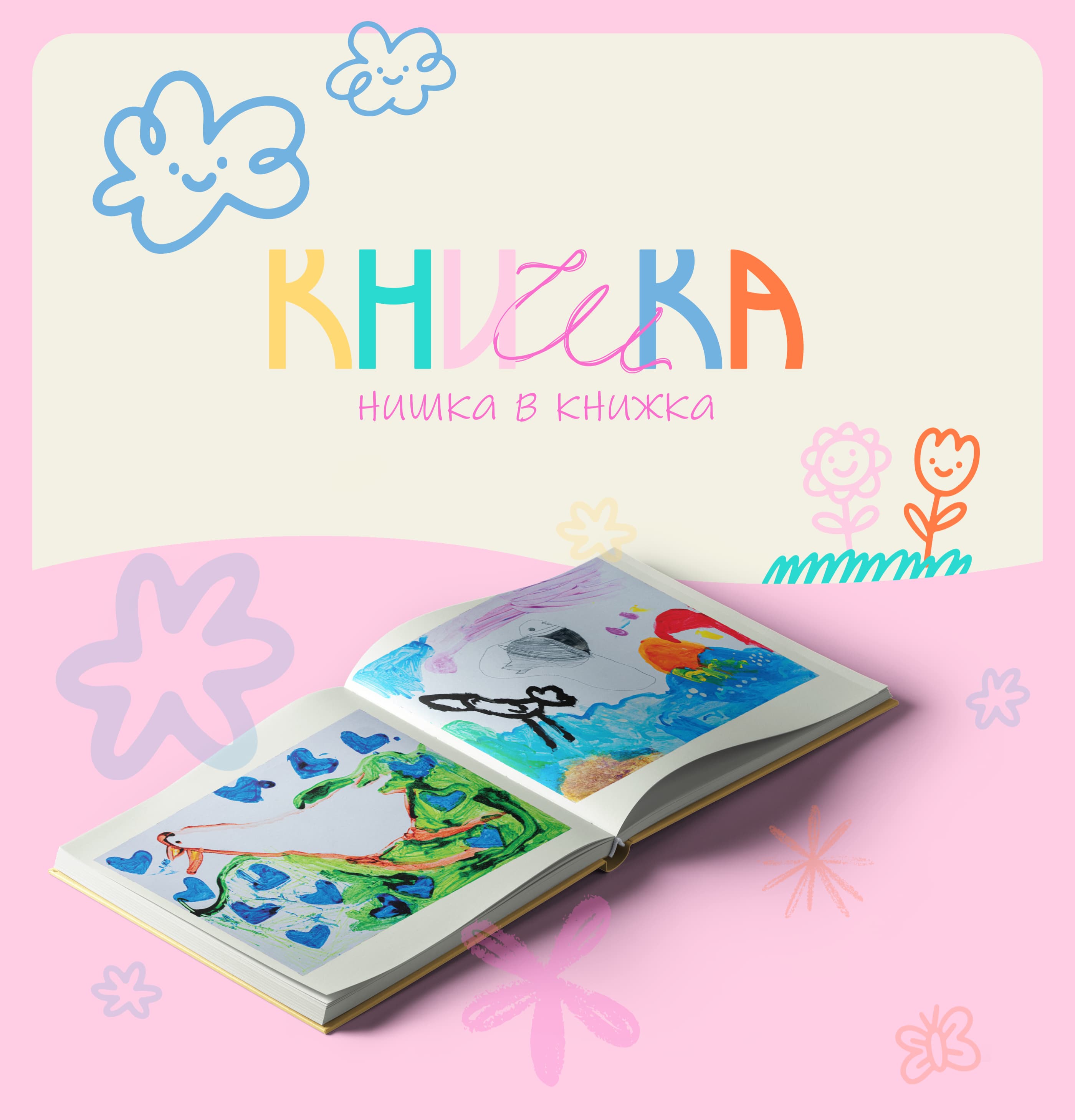
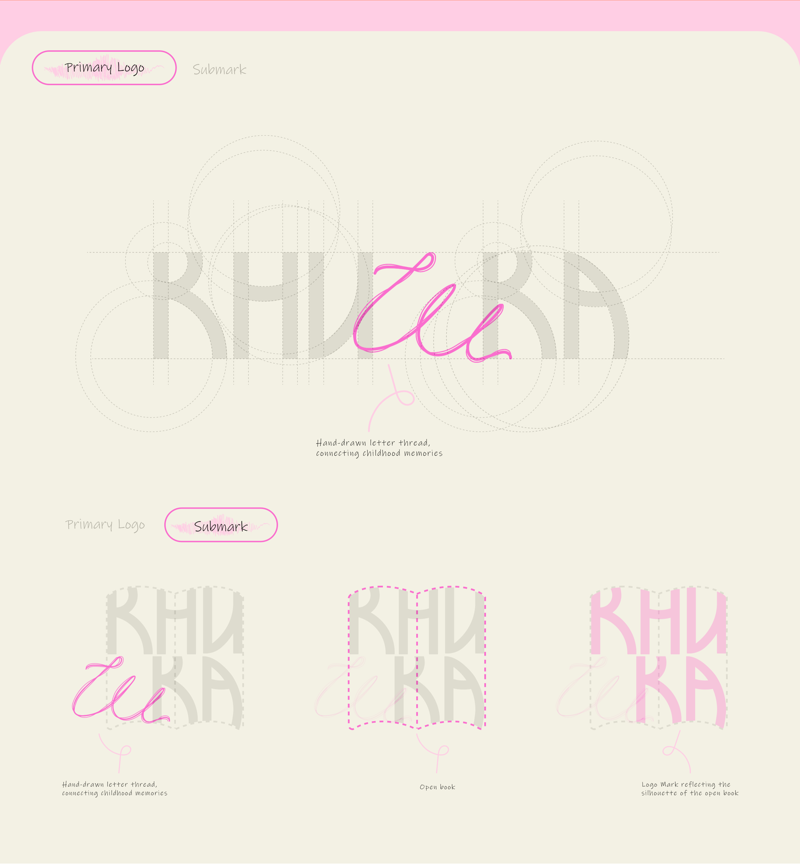
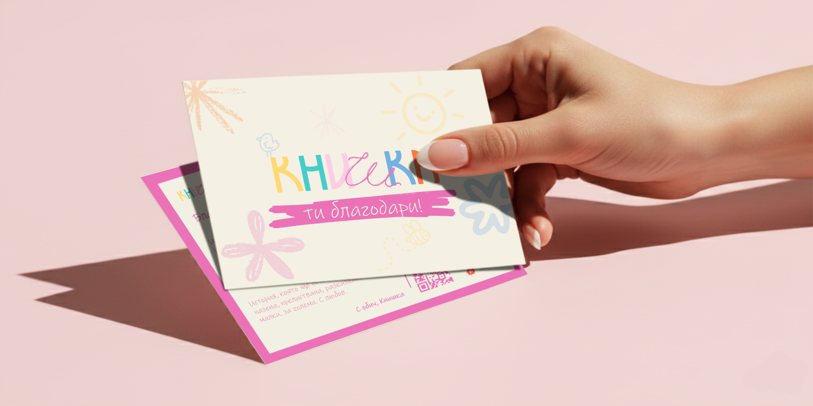
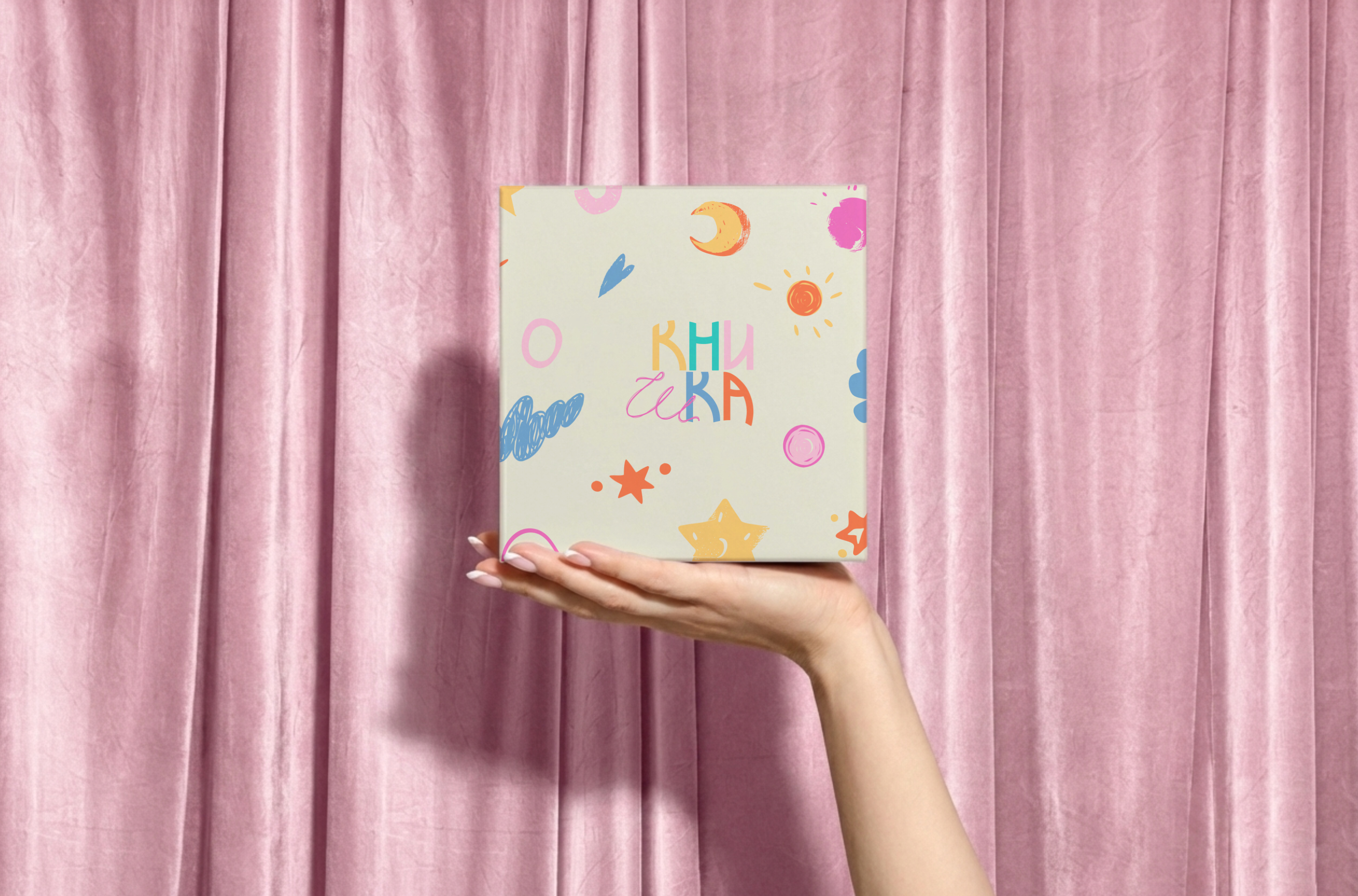
The visual identity is built around a custom wordmark, supported by secondary versions and a standalone symbol for limited spaces. The letterforms are bold and rounded, constructed from circular shapes to create a sense of softness, safety, and approachability. At the same time, the typography subtly references older styles of lettering, not nostalgically, but reinterpreted in a contemporary way. The focal point of the logo is the hand-drawn “Ш” (sh). It appears as if it’s written with a thread weaving through the rest of the word, connecting the letters and visually reinforcing the concept of continuity, care, and gentle connection. This delicate balance between structure and freedom mirrors children’s drawings themselves - confident yet imperfect, expressive yet honest.
Color palette & typography
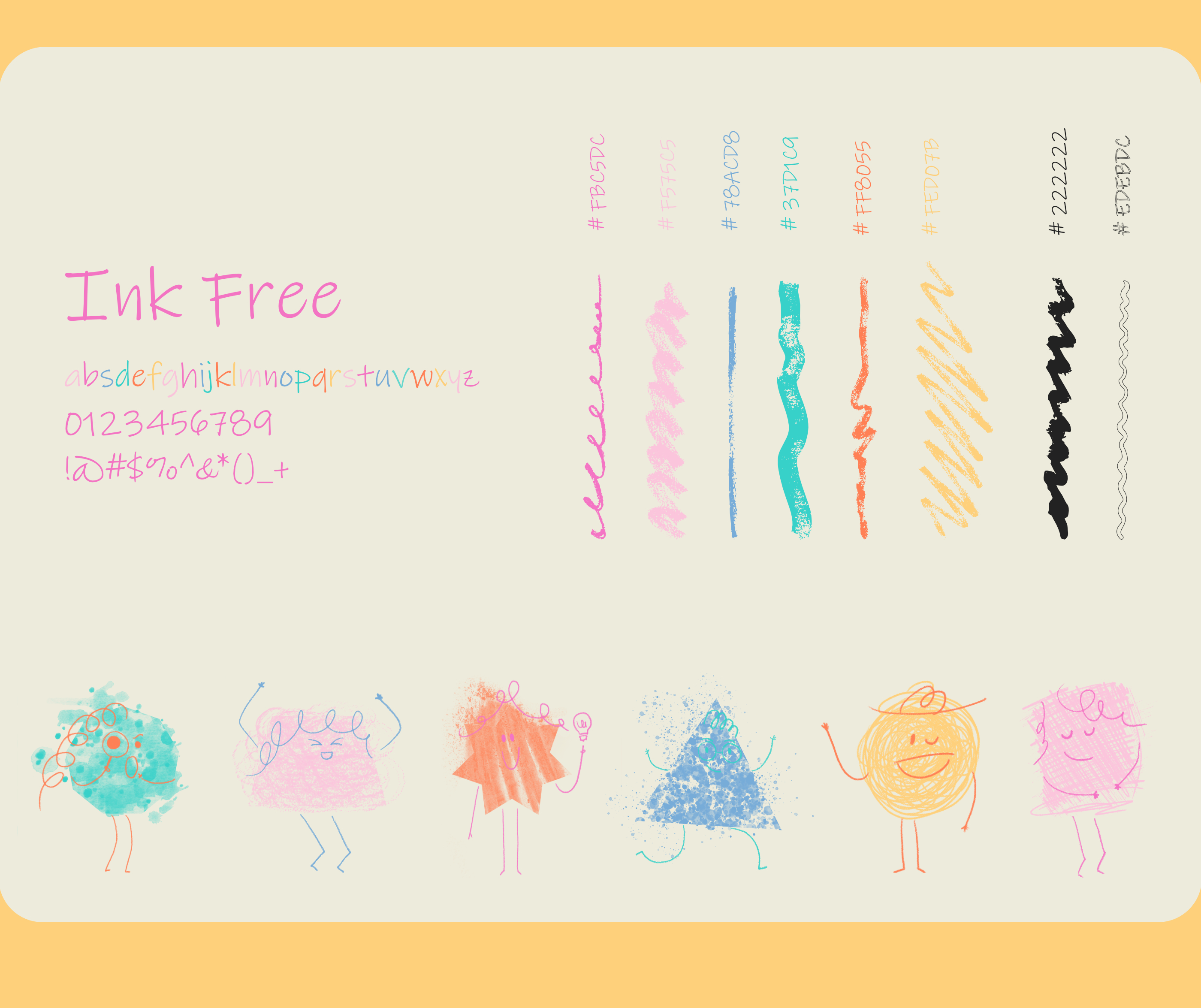
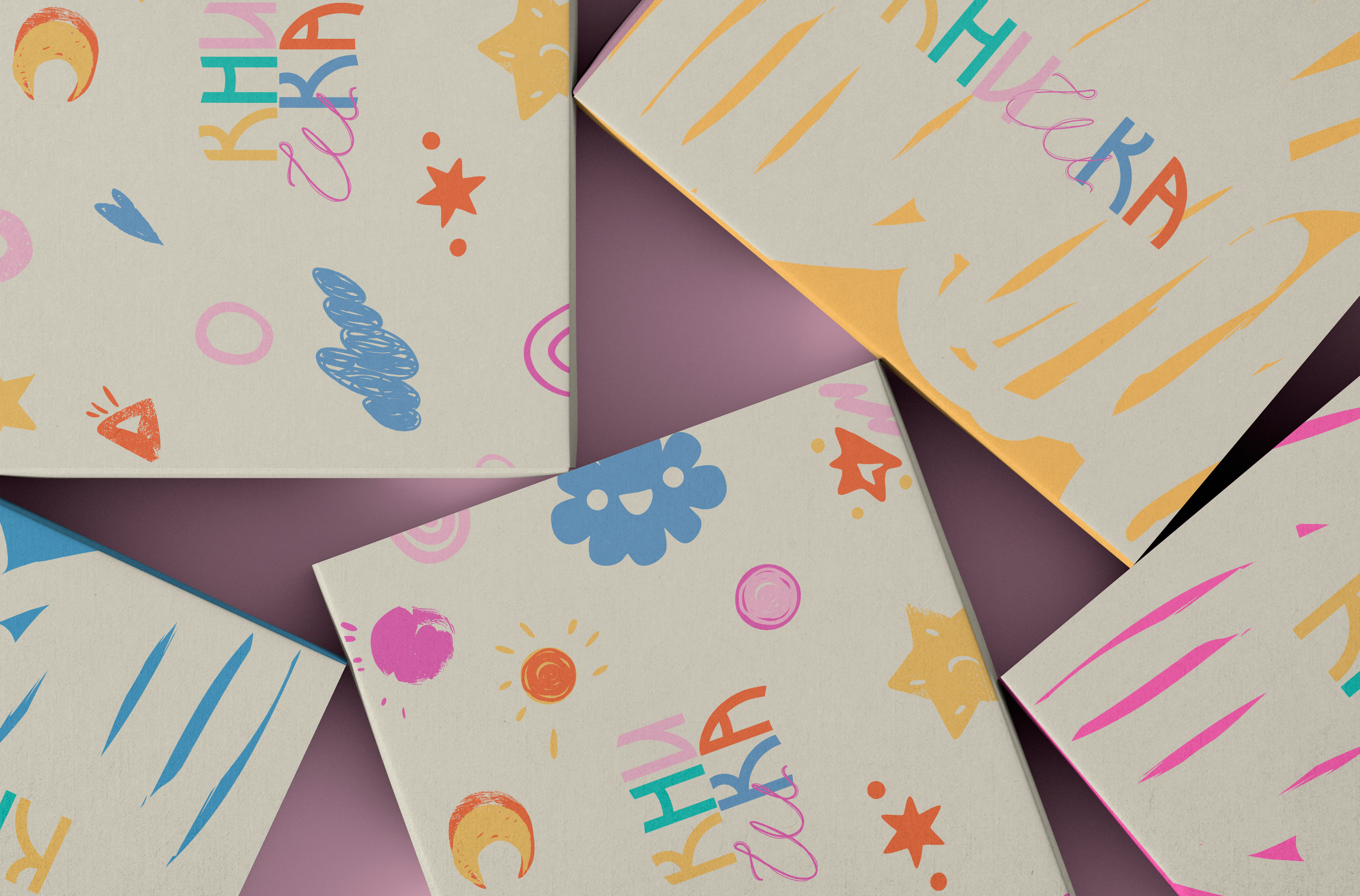
The color palette is intentionally playful and pastel-driven, yet sufficiently saturated to ensure clarity, contrast, and strong brand recognition.
Typography leans toward childlike expressiveness without becoming naive supporting the warmth of the brand while remaining functional, readable, and adaptable across touchpoints.
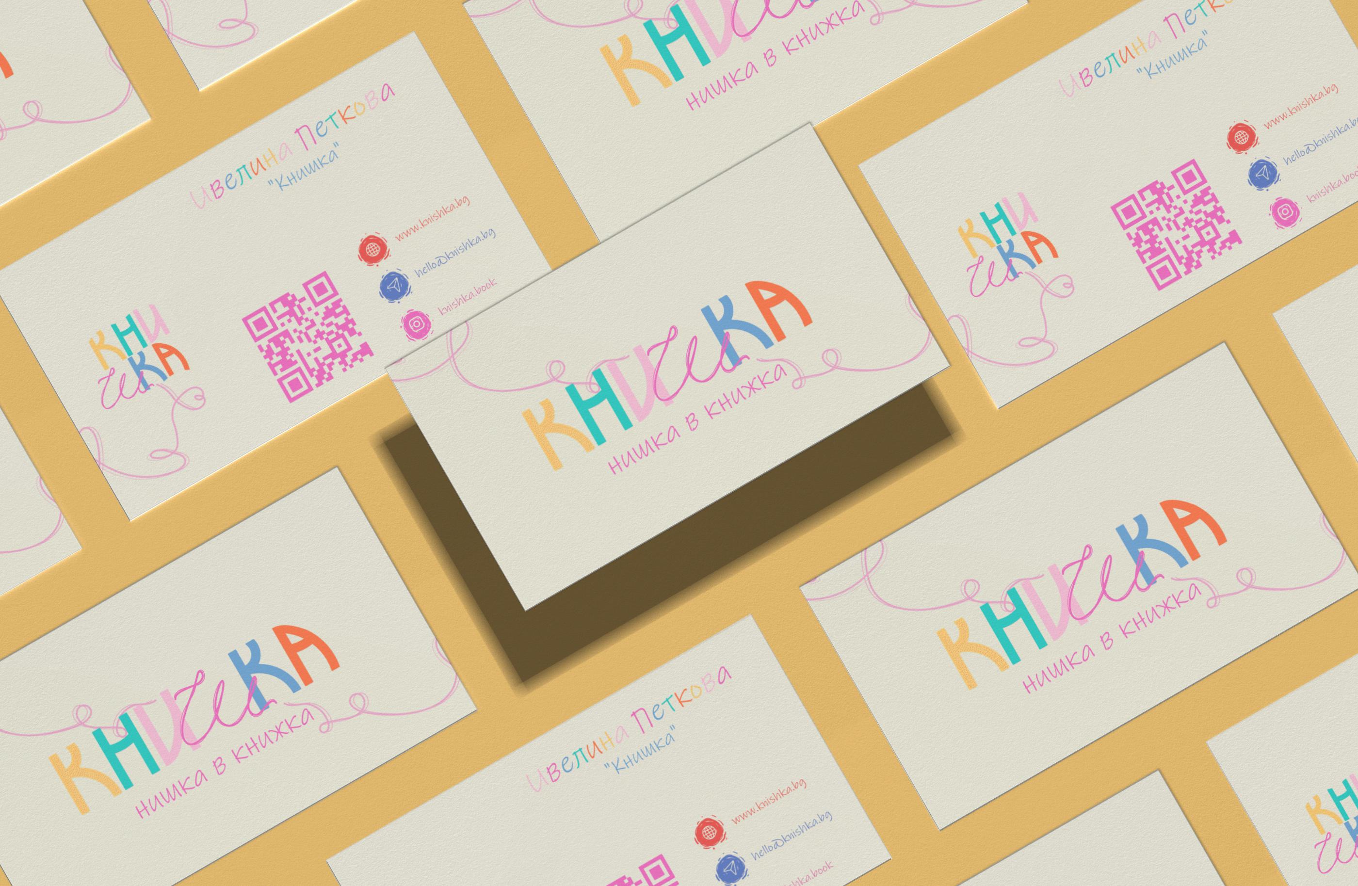
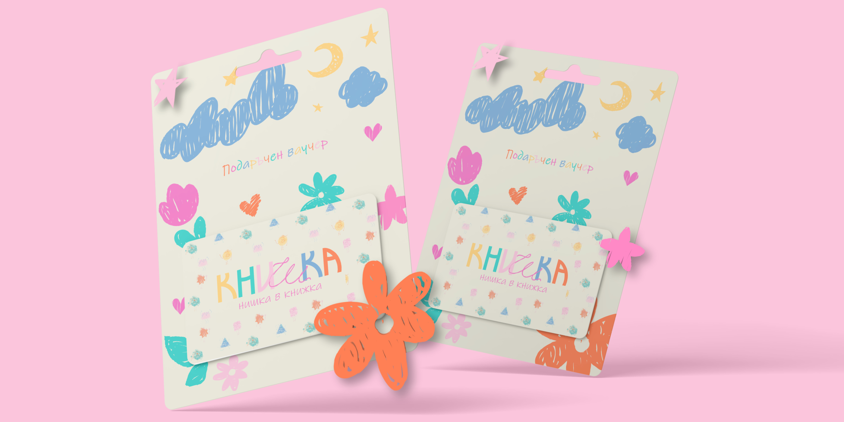
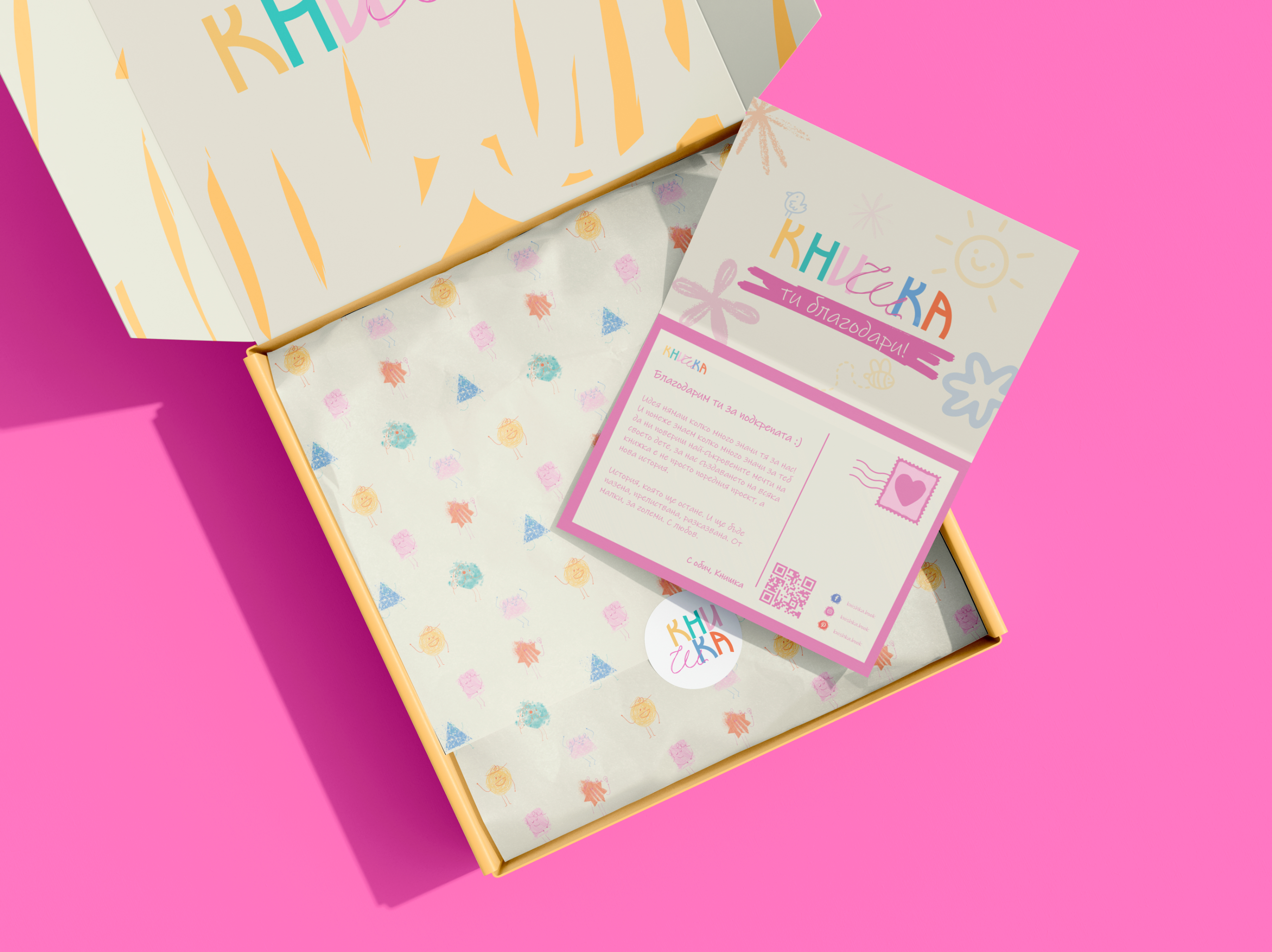
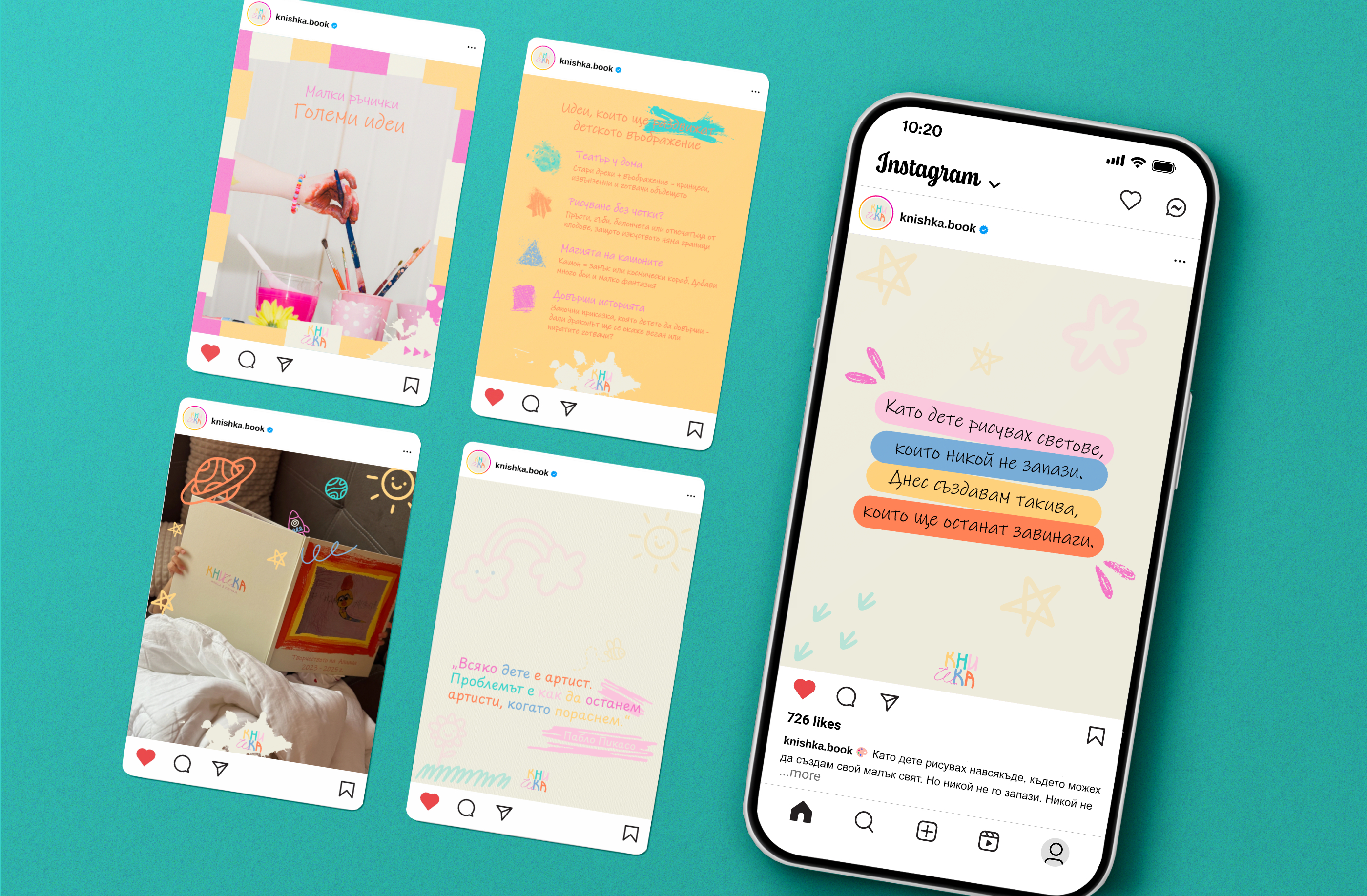
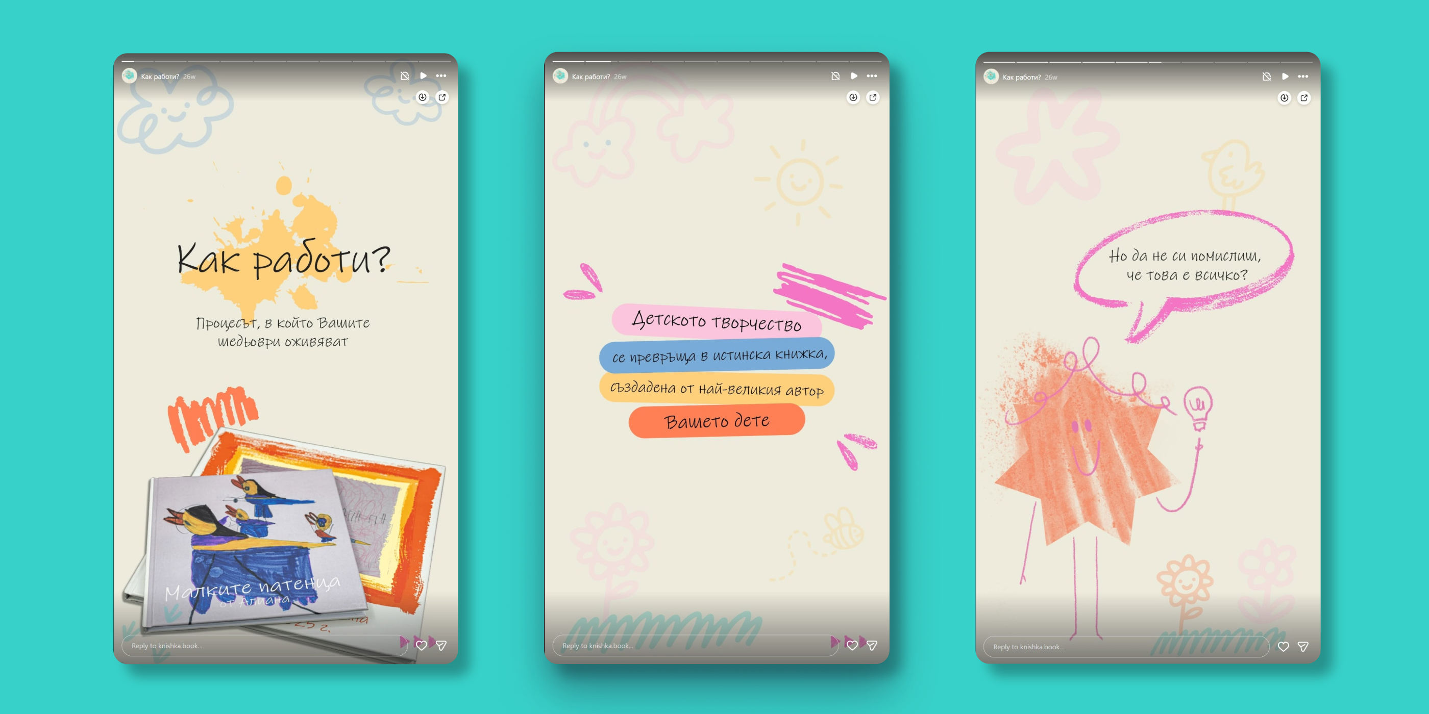
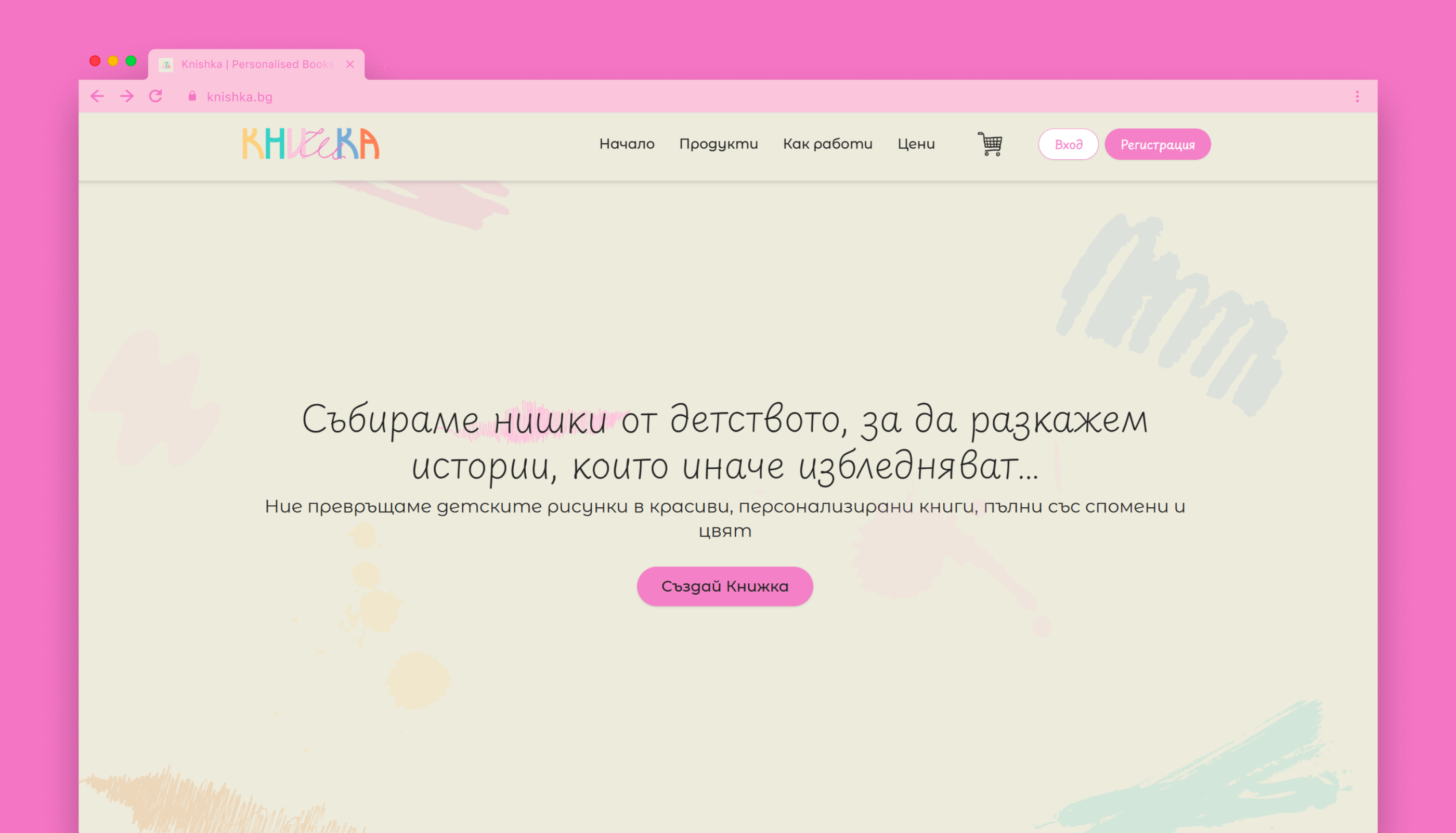
Knishka is more than a visual identity. It is a brand system built around emotion, memory, and purpose. Knishka stands as an example of how branding can move beyond aesthetics to create lasting emotional value.
