Chart Nomads Brand Design
About
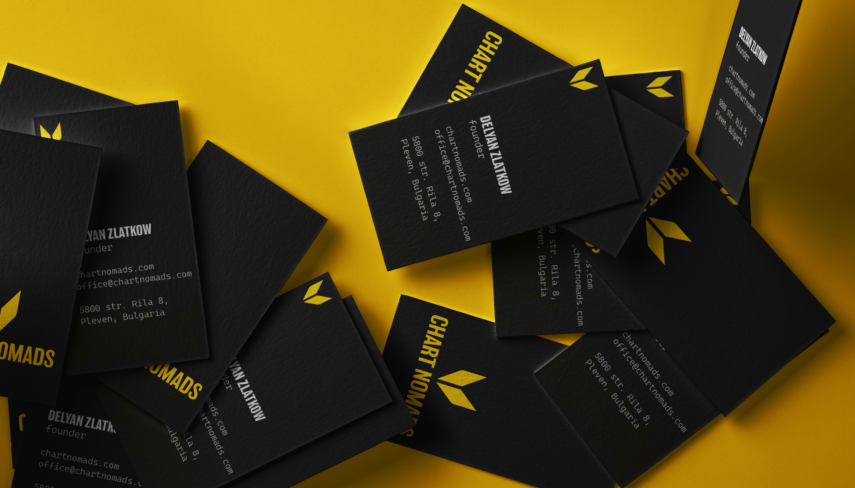
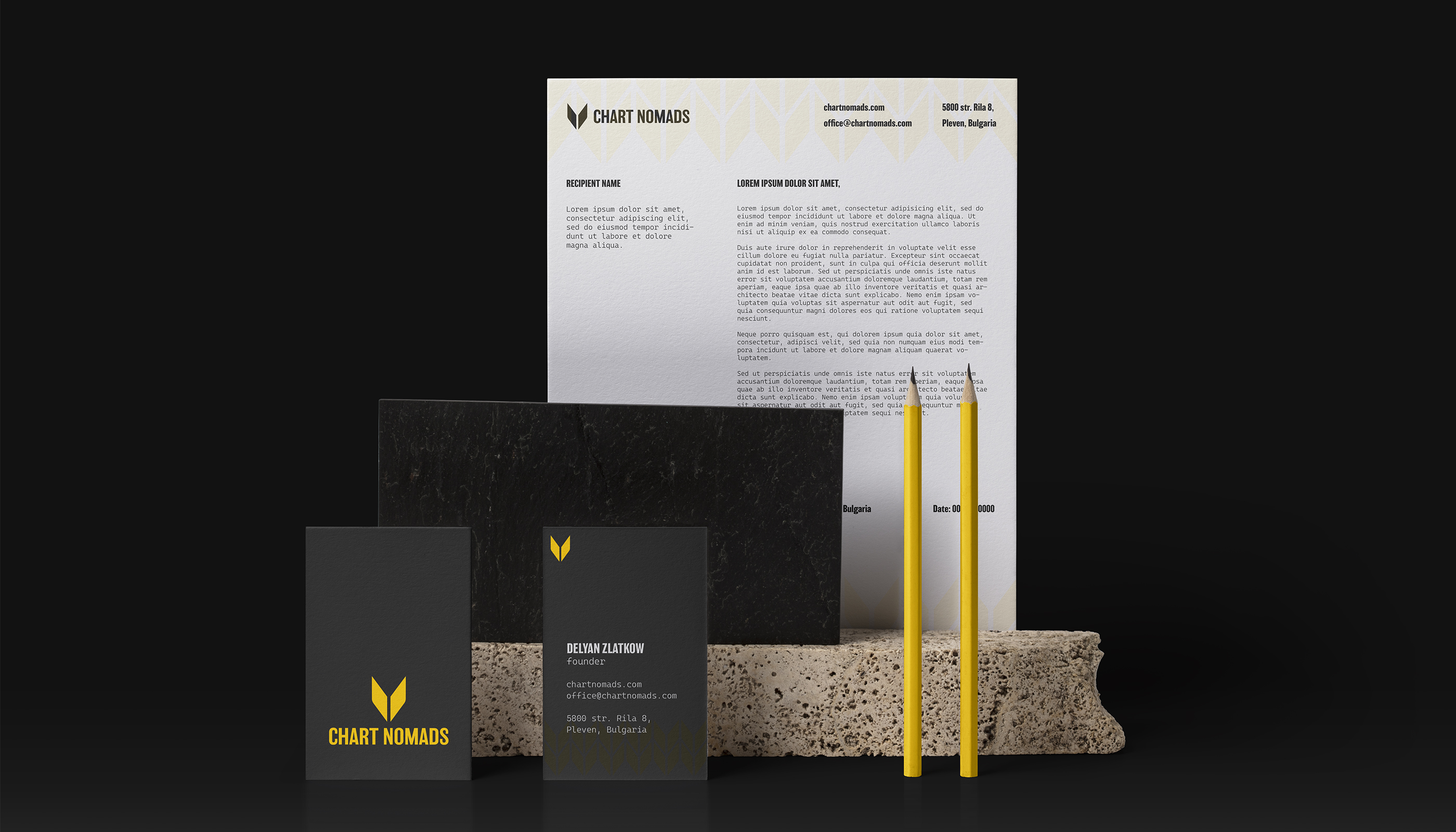
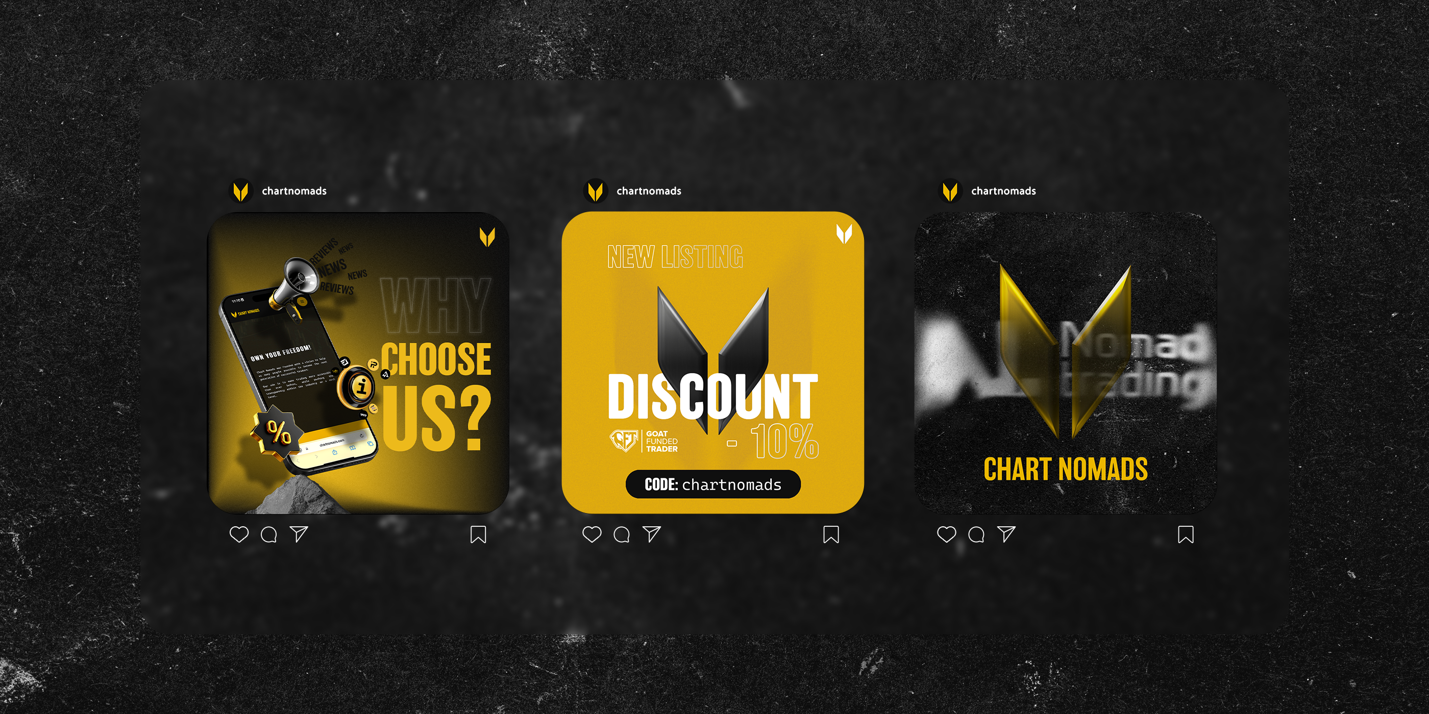
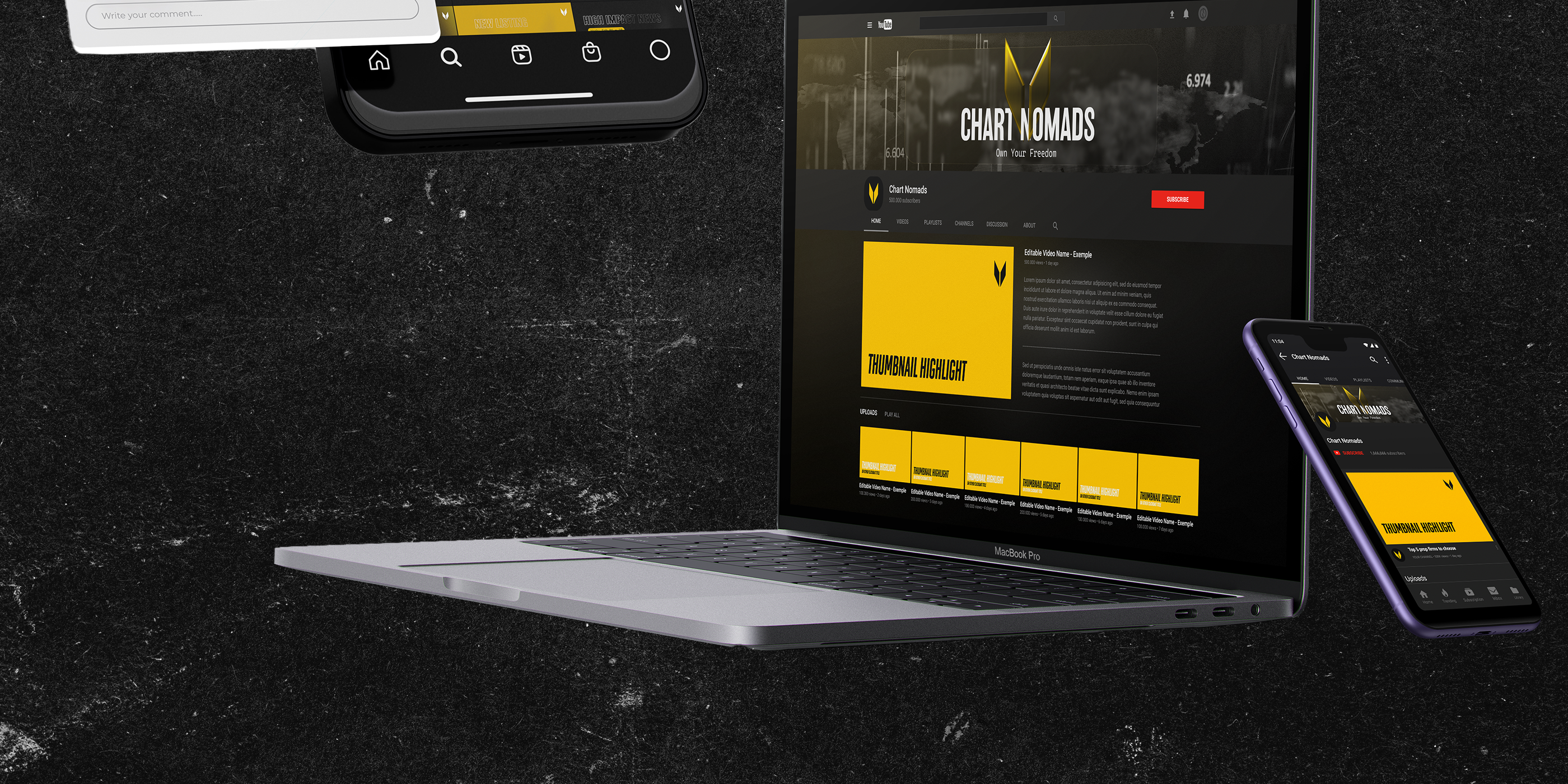
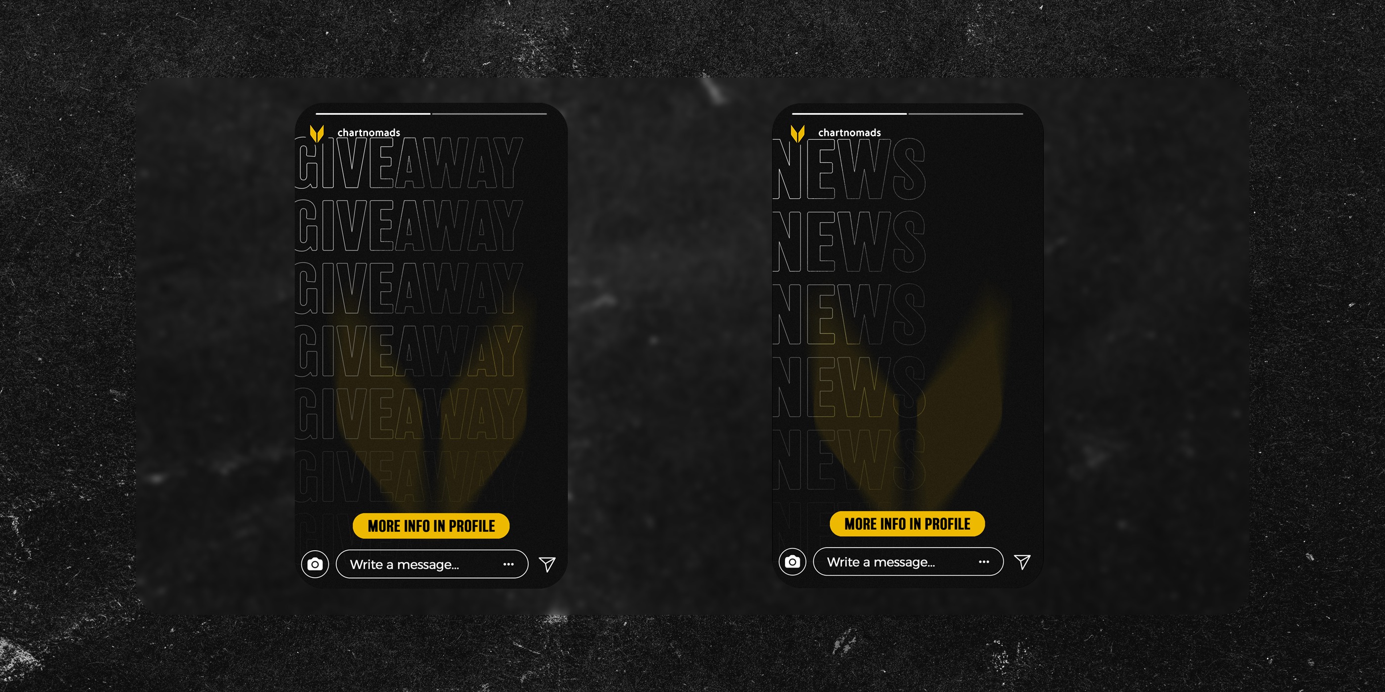
Chart Nomads aims to empower traders by providing a reliable platform for education, reviews, comparisons, and industry insights. Through our collaborative work, I helped Chart Nomads define a clear, strategic brand identity that reflects professionalism and reliability. This included logo development aligning with their "WHY", a visual identity system, and brand guidelines that aligns with their mission and audience expectations. The new branding improved recognition across platforms, strengthened trust with traders, and positioned Chart Nomads as a professional, reliable leader in the trading industry.

Logo design
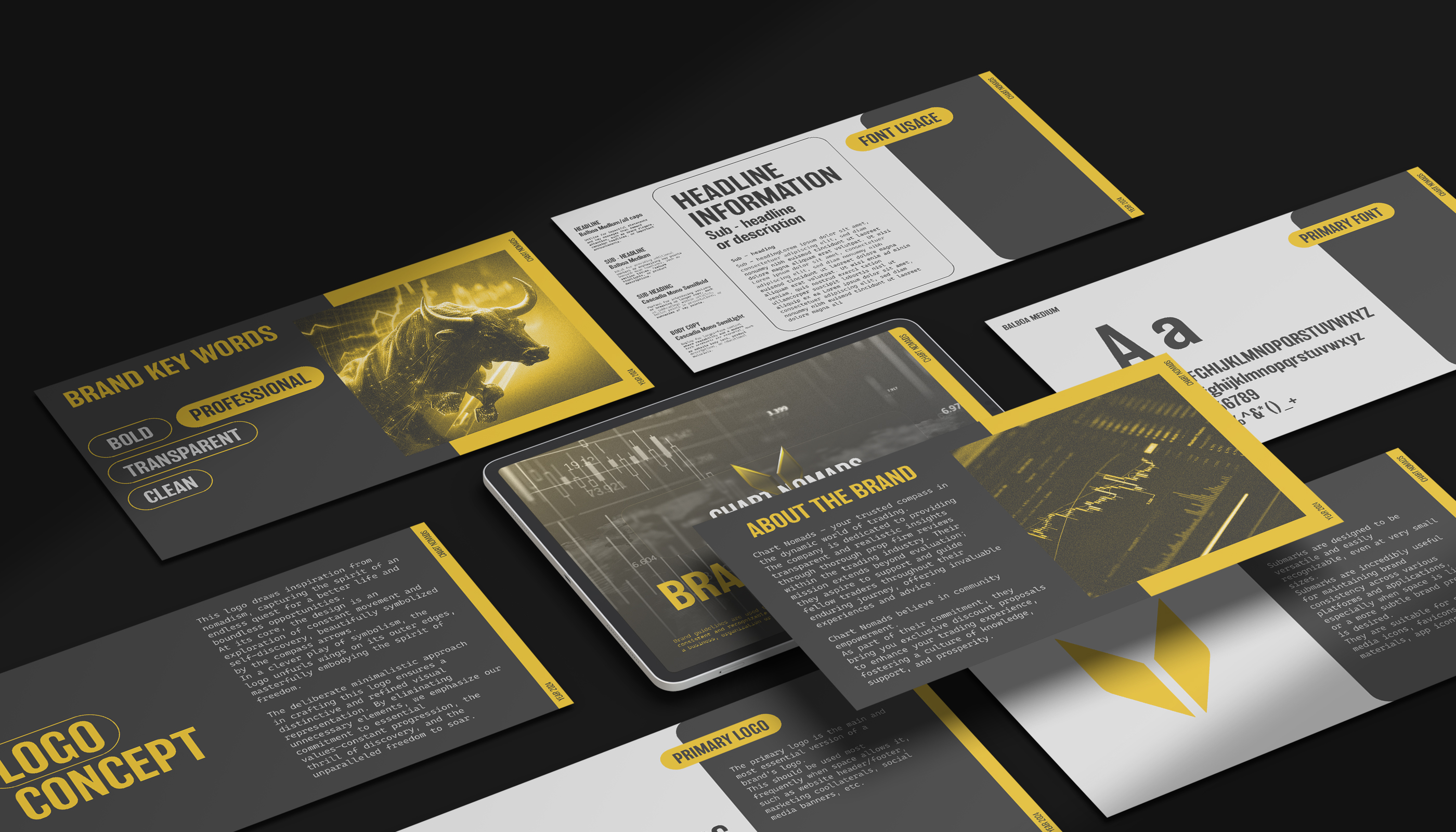
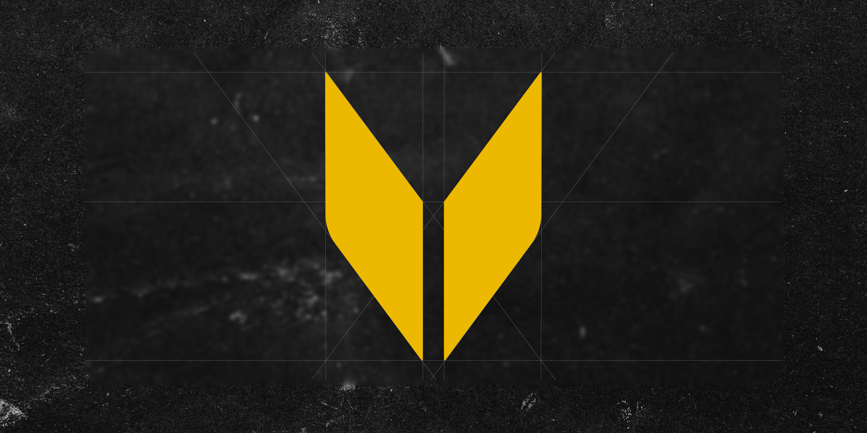
This logo design draws inspiration from the ethos of nomadism, symbolizing an enduring quest for advancement and boundless opportunities. At its core, the design reflects perpetual movement and self-exploration, elegantly represented by the inclusion of compass arrows. These arrows serve as a metaphor for the continuous journey towards self-discovery and progress.
In a clever play of symbolism, the logo subtly unveils wings, embodying the essence of freedom and boundless exploration. This strategic incorporation conveys a sense of liberation and unfettered ambition.
The deliberate minimalistic approach in crafting this logo ensures a distinctive and refined visual representation. By eliminating unnecessary elements, we emphasize our commitment to essential values such asconstant progression, the thrill of discovery, and the unparalleled freedom to soar.
Color palette
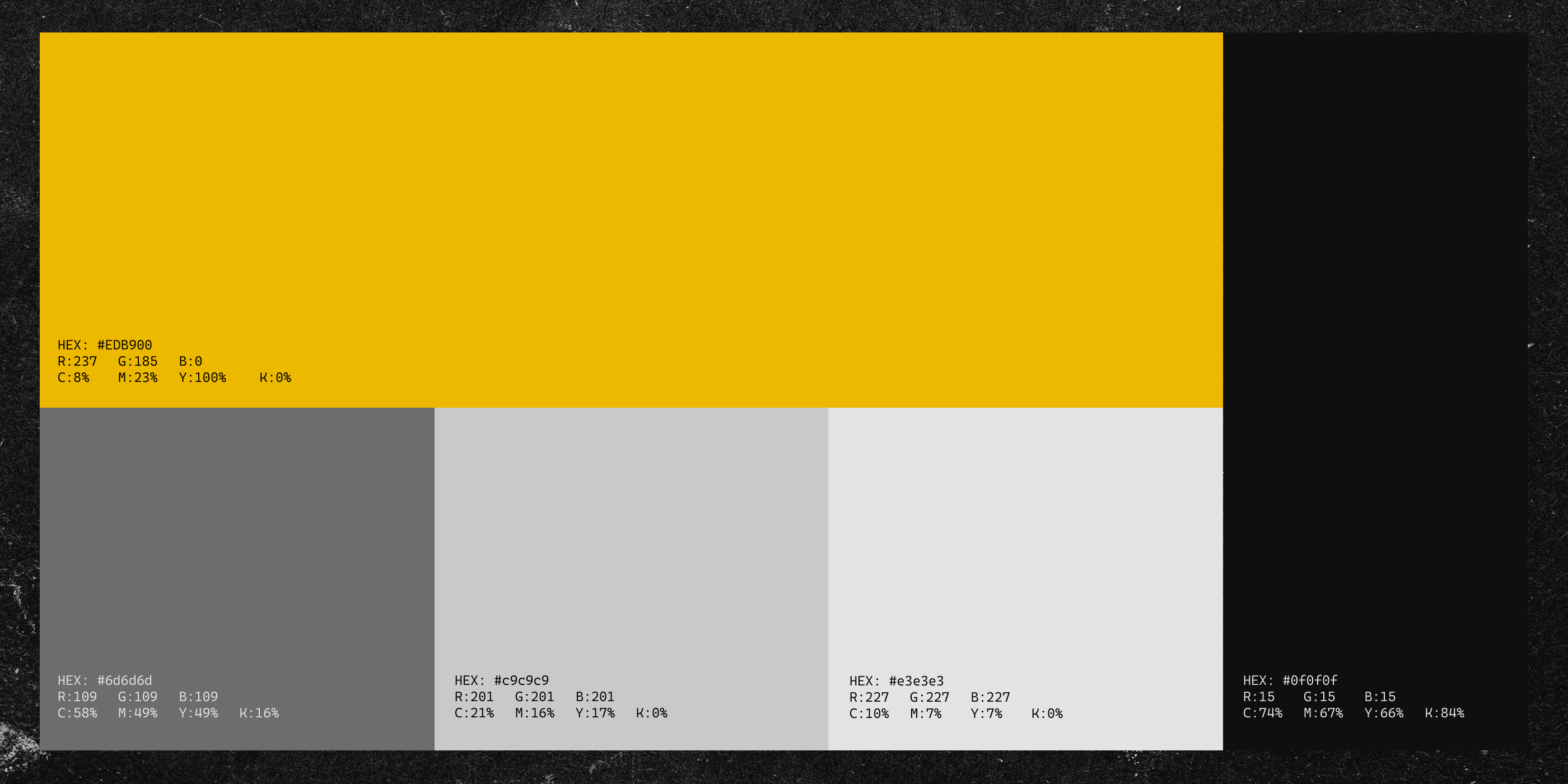
During our research, we noticed that most brands in the trading industry looked visually identical, relying on the same blue and dark tones.
We used this insight as an opportunity to take a different route. The chosen palette strikes a balance between trust and distinction. Bold enough to stand out and capture attention, yet modern and professional enough to fit naturally within its niche.
Typography:
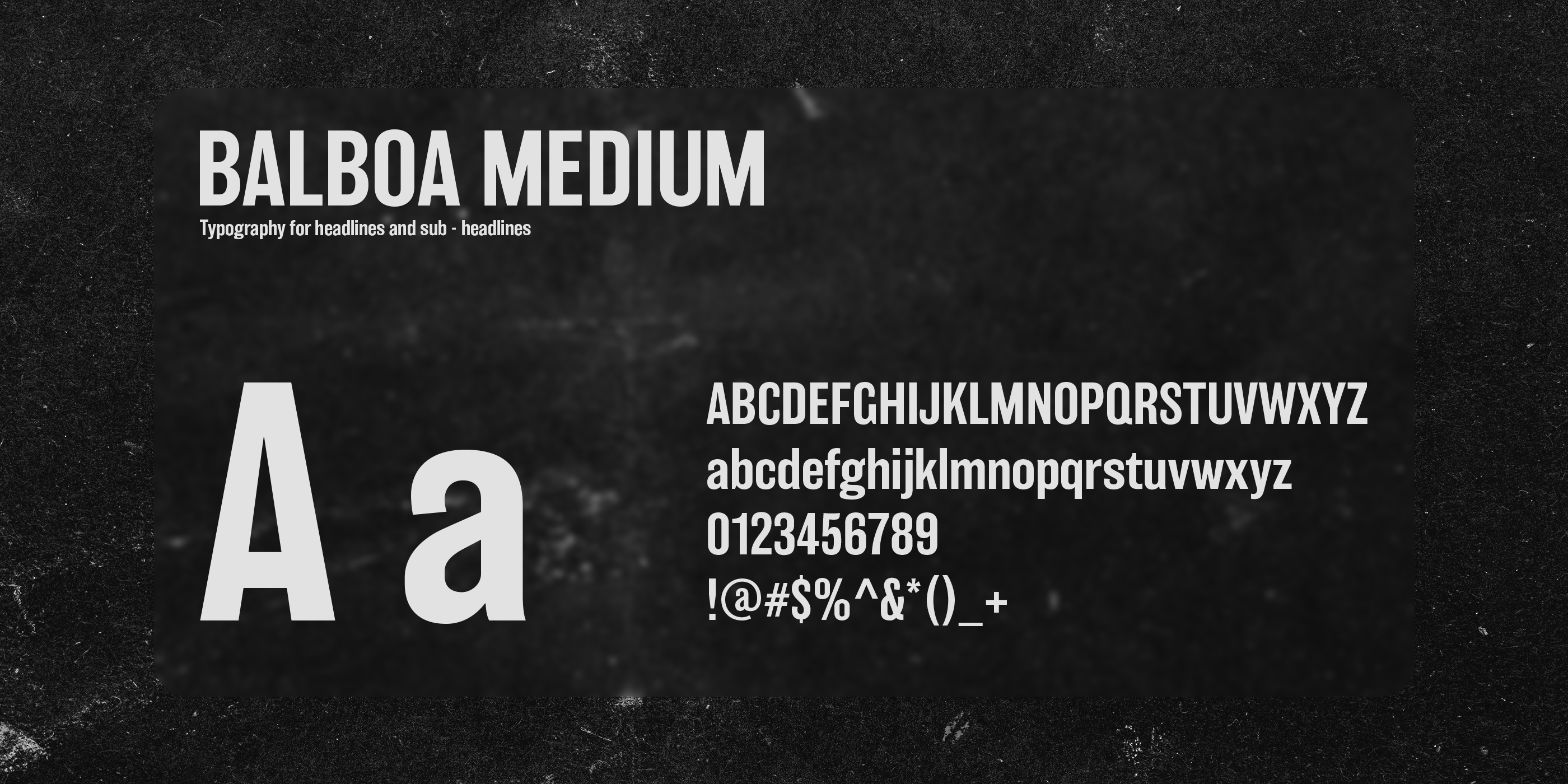
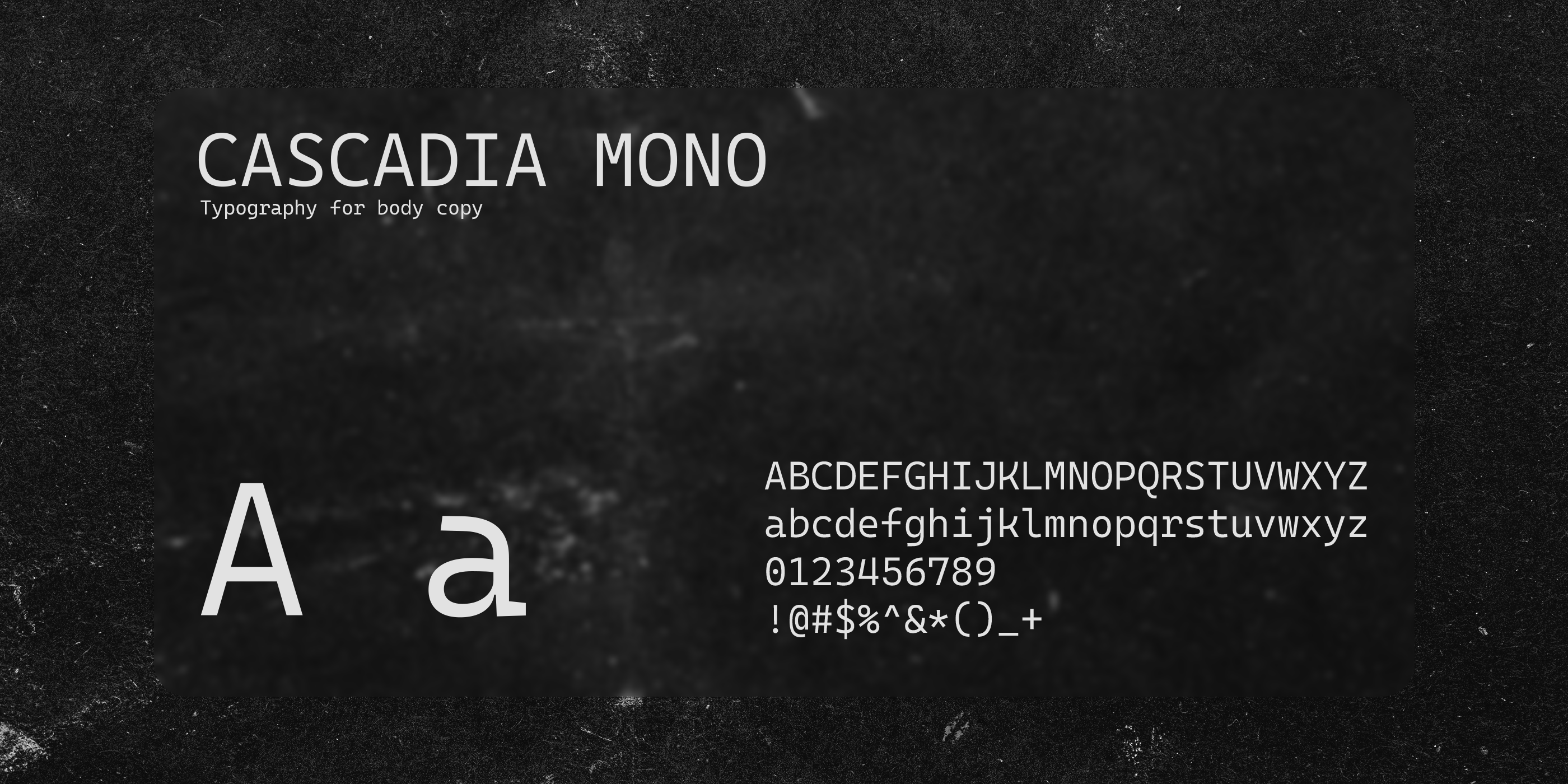
The fonts Balboa and Cascadia Mono have been selected to complement each other seamlessly, aligning harmoniously with the brand's identity.
Balboa, with its bold and assertive characteristics, mirrors the brand's confident and professional voice, while Cascadia Mono offers a clean and modern aesthetic, enhancing readability and clarity.
